Have you ever wondered why McDonalds uses red and yellow, or why many large corporations use blue? We can tell you why.
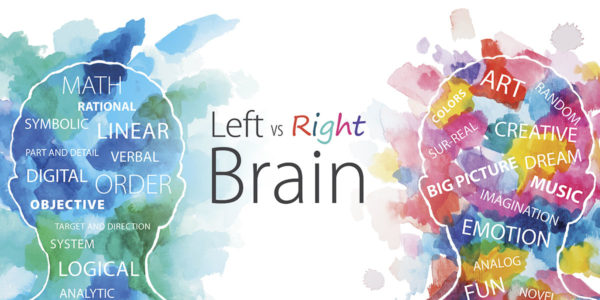
At Sagon-Phior, we view color as very powerful tool that can stimulate emotions. Color can evoke different reactions depending on culture, gender, age and context. I recently interviewed Rio Phior, Partner and creative director at Sagon-Phior who has taught Color Theory at California State University. Rio said, “Color is remarkably in that it causes biological and physiological reactions in all living things. Colors can also effect different emotions. That is why companies need to think strategically when choosing colors especially in regard to their brand identity, products and advertising. Color tells a subtle, yet powerful story. Brands can connect with an audience through color just like they can through design and copy.”
“When we develop logos, brands, marketing or advertising campaigns, we research competitors for clients to make sure we are never duplicating the same color palette as a competitor. Just as a company’s positioning and messaging must be uniquely definitive, so should its palette,” stated Rio. Rio had this input to give on the warmer end of the spectrum:
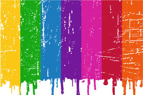
Red: Red is the most emotionally intensive color. It is associated with a variety of feelings; confidence, power, love, passion, or hunger, emergency and danger. Red is a more aggressive, attention-attracting color. Because red is such a riveting and bold color, we caution overusing it. When using red against blues or grays, red can vibrate, making the other colors aside it hard to read. Red is the second most popular color in world. It is usually selected as favorite color of men. If you place the same woman in red dress in a social area, more men will be drawn to her than if you place the same woman in a blue dress in the same environment. A tip for the ladies perhaps? It has been tested.
Orange: Orange is symbolic of new beginnings, ambition, creativity and aliveness. It is considered one of the most social colors. If you paint one room in a building orange, more people will congregate to that room than any other. It enhances social interaction. Be careful not to overuse, as people feel that materials and items bathed in too much orange are cheaper than those that are not orange. However you may be looking for that result, such with a promotion or sale. Many of orange’s more subdued iterations, from peach to cantaloupe, do not have say “economical” reaction. It’s not always easy to find other colors that work well with it. Usually deep purples, rich darker blues and beiges work best with orange.
Yellow: Yellow is representative of cheerfulness, healthy feelings, warmth, friendliness, life giving energy and activity. Perhaps because it is the primary color associated with the sun and daytime. Yellow grabs people’s attention and draws your audience in. This color can also be seen furthest by the eye over and above all other colors. In fact, it is the first color that infants are attracted to. We are fond of using yellow in packaging to help items jump off a shelf. When used with black, it is often associated caution, hazard, yield, danger or the thought of a bee sting. Amazingly, yellow, if stared at for a while, will induce salivary glands to flow and increase appetite.
Check back with us next week for more interesting facts on the cooler end of the color spectrum.