Whether you are a business owner or marketing executive, maintaining the integrity of your brand across a multitude of media platforms can be quite a daunting task these days. If you find yourself constantly instructing or correcting your team or partners on how your company’s identity is being marketed, chances are you don’t have a Brand Guide.
A Brand Guide will outline your brand’s design style and writing standards in a simple and effective manner. Providing your marketing, publicity, and promotional partners with an easy-to-follow guide is imperative to keeping your brand messaging and communication consistent.
Important Things To Include in Your Guide
In the past, Brand Guides were large tomes coded in hieroglyphics for a handful of large corporations and designers to use. In today’s market, its best to keep your guide simple, short and to the point as you will be working with a lot of different partners and agencies, all of various sizes and experience levels.
These are the most essential elements to include in your guide:
Who Are You?
Provide brief concise copy by including a short description of your company’s mission and values. Take into account the copy’s point of view. Composing in the third person (your business name, he, she, it, they, them, theirs) will allow you to highlight accomplishments without appearing boastful and is considered a more academic approach. Using second person (you, your, yours) will give you the chance to address your customer directly. First person (I, we, us, our, ours) is less objective, but friendly.
Artwork
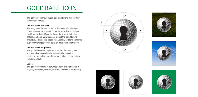
Present your logo, artwork, and usage guidelines in a simple to read manner. Don’t clutter your layouts with unnecessary detail. Showing how an icon or graphic can be used is helpful.
Provide examples
Make sure to show how your logos or artwork CAN and CANNOT be used. Include examples of your logo against different color or photographic backgrounds.
Colors
Remember to include color for PMS (Pantone ink), CMYK (Process printing), and RGB (Digital) values for your logo and artwork. People will be printing, posting, and broadcasting your brand across a variety of formats, so it is best to keep your color palette simple if you want it to be come memorable and look great in all instances. You can provide a secondary palette of accent or additional colors if you have multiple skews of product. Color can be very defining to a brand. Think IBM, known as Big Blue or Target, recognized for its red bull’s eye.
Images
Provide direction on what kind of images you want associated with your brand. Are they graphic or photographical, realistic or metaphorical? Are people posed or caught-in-the moment? Are images cropped into closely for a more intimate feel or sweeping vistas for a more cinematic effect? Are your images black and white, brand palette color-tinted, grainy or sharp, de-saturated or intensely colorful? All of these things go into developing a brand look.
Fonts (Text)
Provide a preferred font and size for both digital and offline (print) use. Google Fonts work best as they can be used in both instances. Otherwise, you may need to include different fonts for each format.
Application
In addition to providing examples, show how the brand can be applied to your website, e-marketing, advertising, marketing collateral, packaging, merchandising and signage (environmental, vehicles, etc.)
Video
If you want to take your style guide to the next level, consider having a video produced. Capture the ‘essence’ of your Brand in an emotional and compelling manner. Use your video to double as a sales tool and internal presentation piece.
A lack of consistency with your brand will weaken it over time. With 2.4 billion Internet users around the world, it is now more critical then ever to establish a consistent message with a Brand Guide. Most importantly, creating a guide will help you define your brand from competitors – before someone else does.
*Sagon-Phior has designed Brand Guides for The Olympic Games, CBS Sports Network’s Secret Golf, Gelson’s Supermarkets, American State Bank, Condusiv Technologies, 360 Vodka, Leukemia & Lymphoma Society, The Daily Grill and Grill On The Alley restaurant chains, and feature films such as the Star Wars Trilogy and Men In Black, among many others.


